Arrowhead’s New Logo: Love it or Hate it?
This year, Arrowhead got a new sports and academic logo. Students say they have mixed feelings about this new change because they have been used to the Arrowhead High School logo for 15+ years.
Arrowhead decided to get this sports logo, because our previous logo wasn’t a Warhawk.
The school needed something to show their pride and set them apart from other local high schools.
The new sports logo has the Arrowhead block A with One Team. and above it a red Warhawk with a smaller block A at the neck of the Warhawk.
The principal of Arrowhead Union High School, Gregg Wieczorek said, “We didn’t have a logo with a Warhawk on it, we had a block A. We never had a logo with a Hawk in it, we had a group with people involved for the decision making.”
There was group of people who were able to decide which logos students may or may not like. Some students liked the idea of a new logo, but others not as much.
Senior at Arrowhead Maddie Kopecky, says, “I do not like it, because the other one was more original and appealing to the eye. This one has a lot going one with two block A’s in the one logo.”
Liz Arsnowl said that currently students and parents are not able to have access to the logo, as it is in the works of becoming branded.
Wieczorek also says, “It was professionally done by a company, and we have the copyrights to it so no other school can use it.”
Seniors Max Geitlinger and Ryan Schmitt say they don’t like the new logo, “We don’t like it, it looks like a penguin.”
On the other hand Language Arts teacher Mike Feuerstahler said, “I think it looks ferocious and great.”
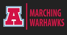
As well as the sports logo, there is also a new academic logo. It is a block A with the Arrowhead colors, red, blue, and a darker grey.
Some students say they like this logo better.
Senior at Arrowhead, Alaina Cardella, said, “This logo looks well made, and something that represents Arrowhead well.”


